I’m not sure if we can use Vanguard again or not without moving people to that company. I don’t know how the reservations work if it’s account reserved or character reserved. People who transferred servers have to drop their company and the name isn’t always available again after the 24 hour thing. Will have to see if thats a popular choice.
I’d also like to avoid having one simply named OTG unless we get down to one guild.
Or really, how much for any of the paid ones? If it’s a modest cost, we could have a fund drive. I have a mild preference for the ones that cost simply because we won’t see them so often as the freebies.
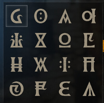
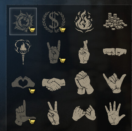
I like the ones where you can tell them from a distance, not too fiddly.
All that said, my faves are all free. I like the flames one because we’re light-bringers, no? Theoretically.
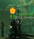
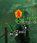
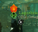
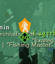
My suggestion would be any of the “O” shapes. They work from a distance, and support “OTG” and “Omega”, if we keep that, or “OTG [something else]” if we don’t. There are a few, so we could have more than one OTG with an “O” as the banner, even “OTG-Vanguard”.
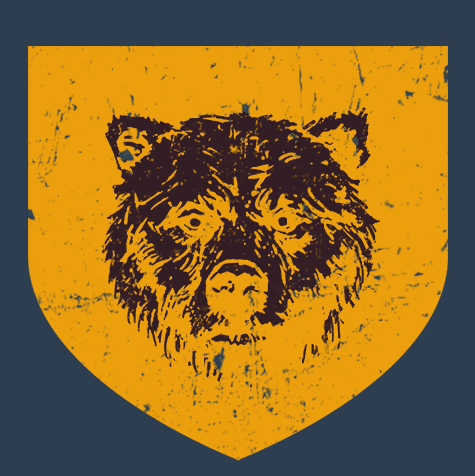
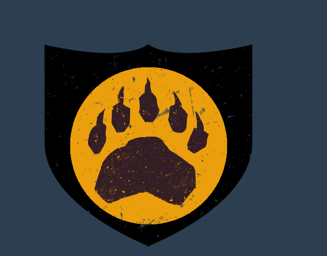
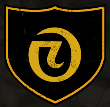
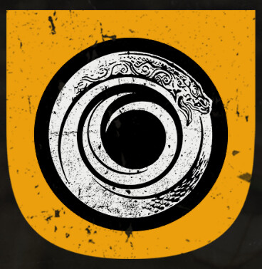
For the logo, from what I saw running around for Ebonscale Reach, I didn’t see anyone else with a black background and yellow circle like the paw crest Awduum created. I’d vote for that one to make it stand out more.
For the name, I don’t really have a preference. I’m good with all of the ones that have been suggested so far.
I just jumped into the game for the first time in a long time recently. (Been in game a few times and even joined in chat and talked with some folks.) Haven’t asked to rejoin the guild yet since I’m just trying to get a feel for whether enough has been done about the stuff I didn’t like to let me get to having fun. But, that had me look in the NW forum and saw this. So, take this with my grain of salt.
I agree not to drop down to just an OTG guild name. Honestly, even if there were going to be just one guild I would suggest never just using OTG unless the guild has unlimited size. If the game jumps up all of a sudden and a second guild is needed… you are back in the guild name game challenge.
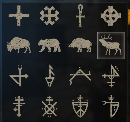
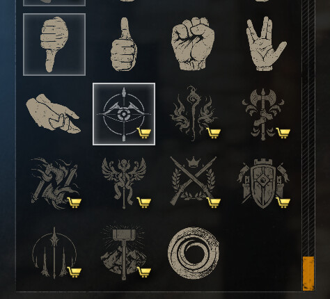
I like the ouroboros themed crest (last pic in Sonicat’s post just above). I also like the swirly crest in that post. (It appears twice just after the current crest.)
Assuming that shield shape is independent from crest, I think it would help to see which crests people like on the different shields. (For example, I think the ouroboros would look better in a shield that isn’t colored in…)
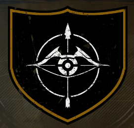
For the most part the feedback I am looking for is related to the actual emblem itself not the full banner. As we don’t and have no aspirations to own territory the most important part here is that in game when very small and over our heads is it distinct and something we can pick out in a crowd.
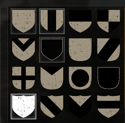
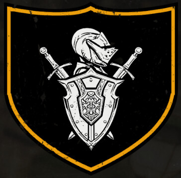
The thing I hate about the system is how they don’t offer the same backgrounds in all shapes of the shield component and many of the backgrounds are a 50/50 horizontal segment making top left corner black and bottom corner yellow, or a yellow stripe down the middle with black edges, or checkered. There is no option for a border on the emblem which is the only part that you can change the color on. So 90% of the combinations look absolutely hideous.
If someone sees a background I’ve shared and it looks good but wants to see it with a different emblem let me know.
So i realized playing with this today that the crest background is the same no mater what you choose on the nameplate. That sucks. It also doens’nt honor any of the style you have to it stripes, hatches, whatever. Its faction color background with your emblem foreground.
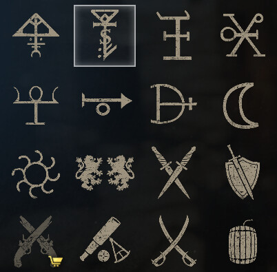
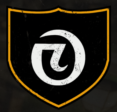
To me the white oroboro logo doesn’t stand out enough in white and it looks aweful in red imo.
The swirly O looks okay in white or red. Red I think stands out more in a crowd.
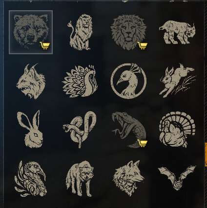
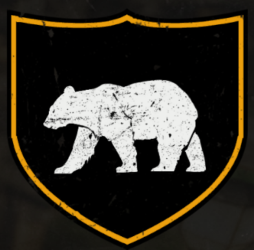
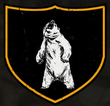
The bear works too in both colors.
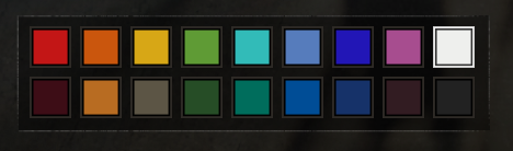
I do think that the Red Emblem on Yellow will stand out more in crowds for people since everyone seems to have white emblems in our faction.
Not impressed with the new company logo. Just my opinion, and apparently not the majority since we went with gaudy, I don’t get the significance of the circled upside-down 2. I think it’s the red that makes it look so bad to me. Not sure.
I can’t help but think Safeway (grocery store) logo. First thing that came to mind.
Do you have any constructive feedback on the other screenshots I shared earlier?
Intricate designs don’t stand out on the over head nameplate crests which is what I’m trying to address for people who easily get lost in crowds. Having a highly identifiable crest is my goal.